The Overlooked Design Pattern: Containers & Their Styles
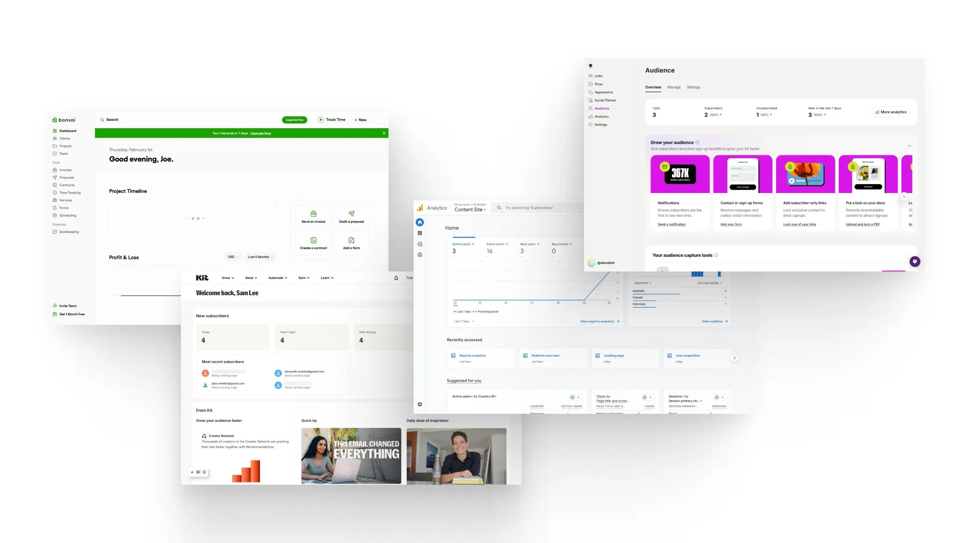
When designers start assembling UI components into a page layout, the focus is often on individual elements—buttons, cards, and forms. But what about the containers that structure and visually group these elements?
Where the Problem Lies
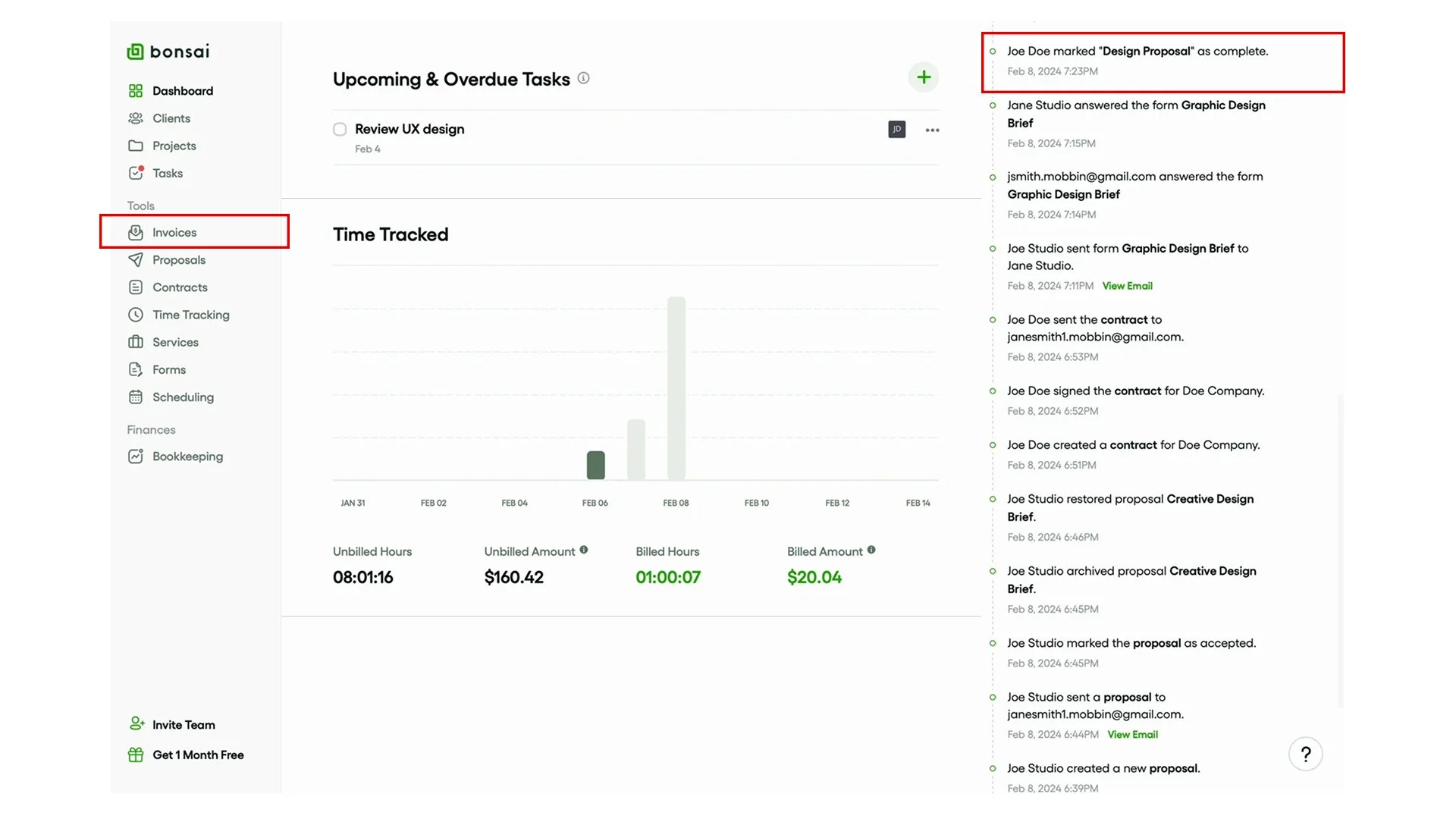
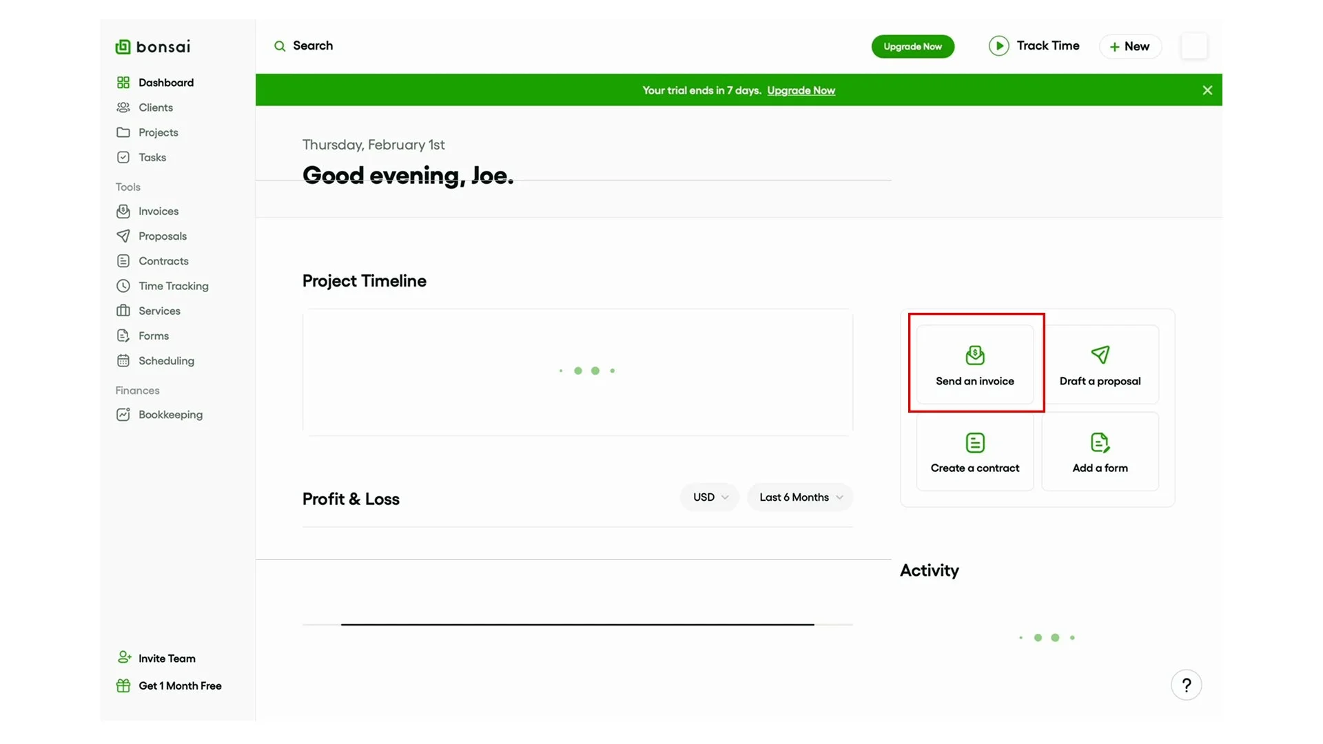
While design systems document components like buttons, cards, and modals, they often don’t specify how to visually group related content. This leads to inconsistencies—some designers use drop shadows, others rely on background colors, and sometimes sections don’t feel visually unified at all.
Existing Documentation: What Material Design Covers
The closest reference I’ve found is Material Design’s Color Roles & Elevation documentation. Material’s guidelines define:
Surface & Outline: Background colors and contrast for layering elements.
Elevation: The use of shadows and elevation levels to create hierarchy.
While these principles help with layering elements, they don’t provide clear guidance on when and how to apply visual grouping styles within a product’s specific UI.
Grouping UI Elements: A Missing Framework
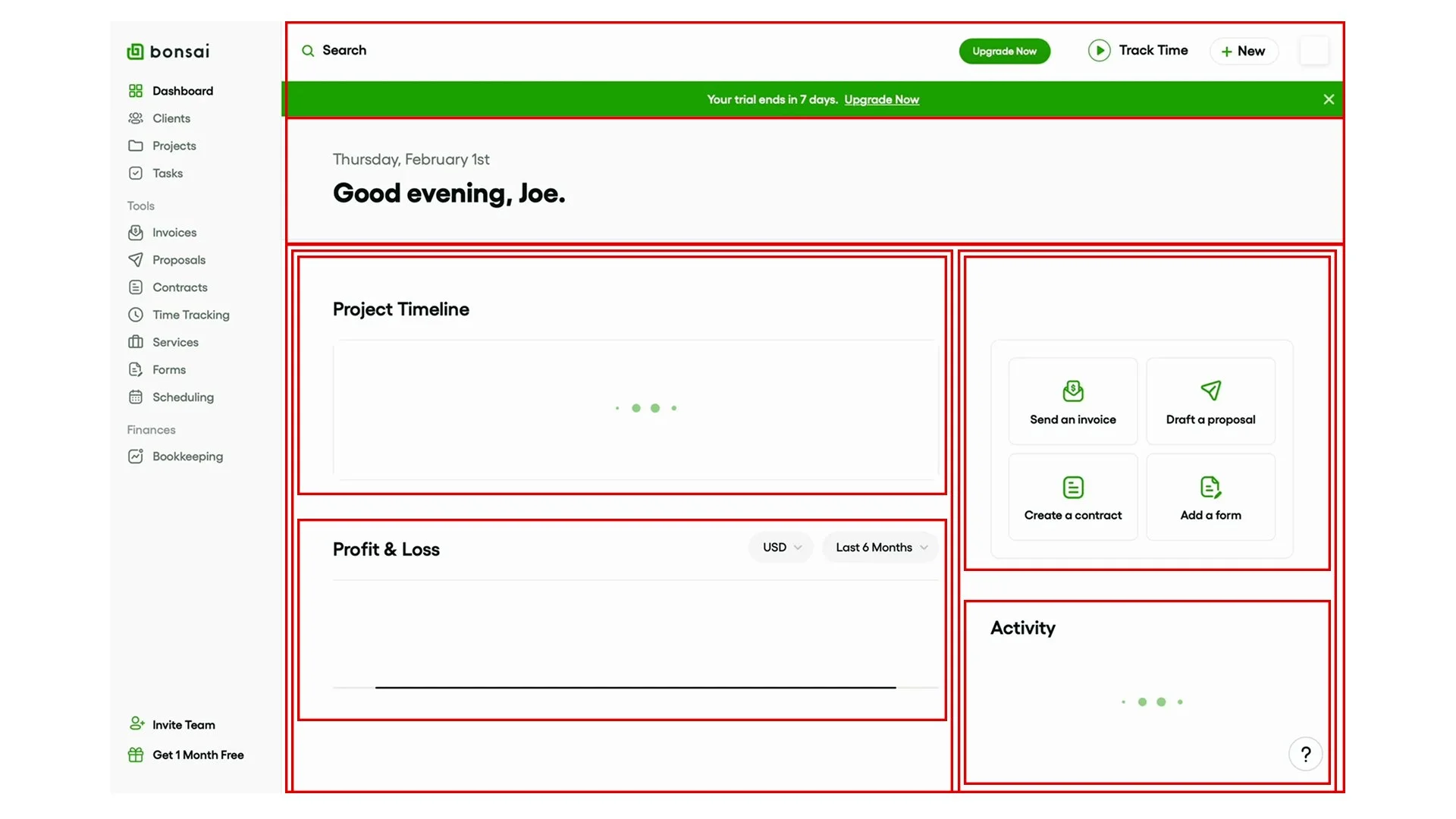
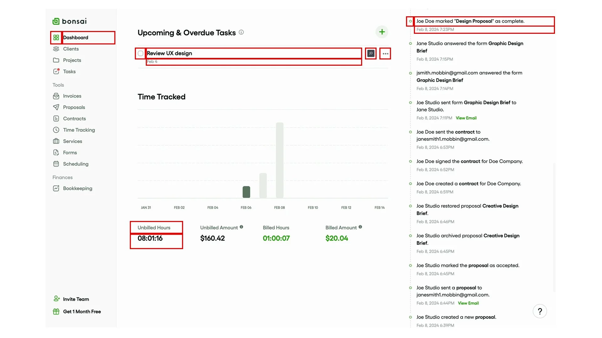
Here’s an example of how UI elements are typically structured:
Section Hierarchy in UI Layouts
1. Page (Root level, primary background color)
2. Scroll Containers/Views (Parts of the page that scroll or are fixed)
3. Section (Group)
4. List (Group of items)
5. Item (New Component, e.g., a Card)
6. Component (Contained Design System Components)
Proposed Solution: Defining Container Styles by Hierarchy
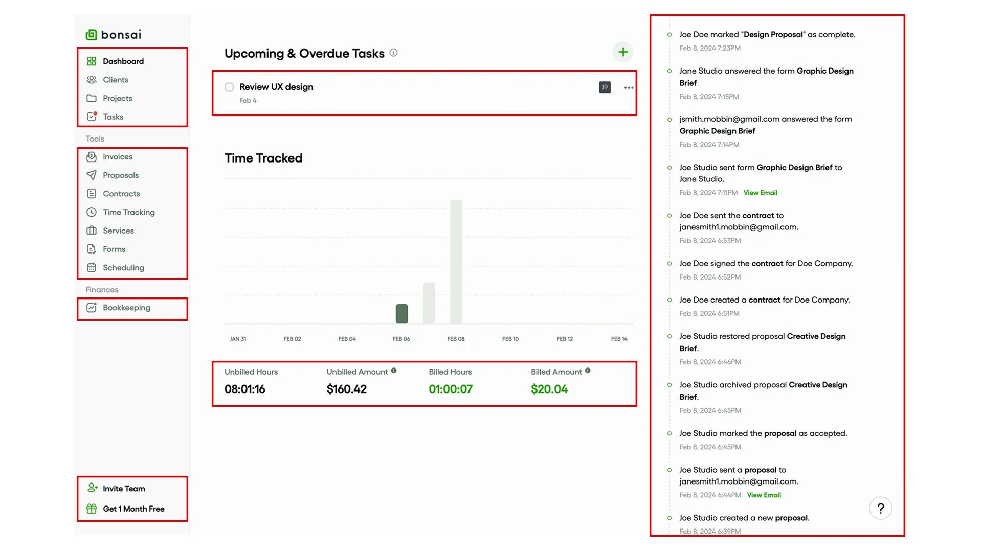
To eliminate ambiguity and inconsistency, container styles should be explicitly documented in design systems. For example:
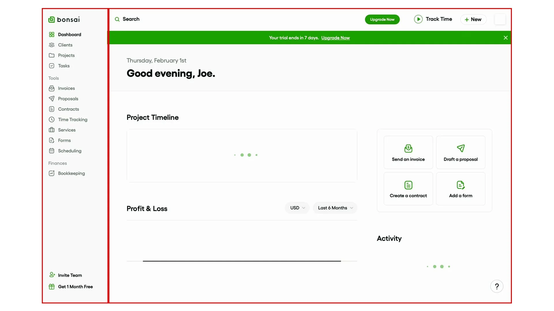
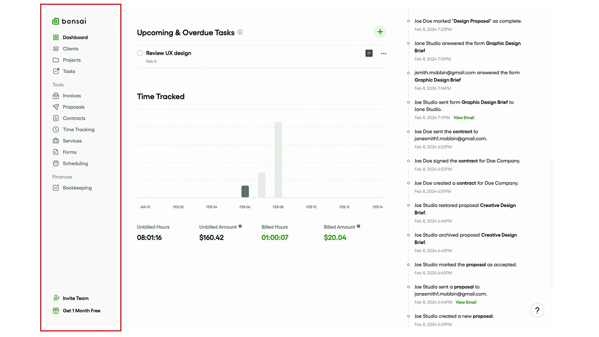
Fixed Container Sections (Sidebars)
Use a background color to define grouping at a macro level.
Sections within Page Content
Outline content
Lists
Flat within sections, maintaining clear padding and spacing.
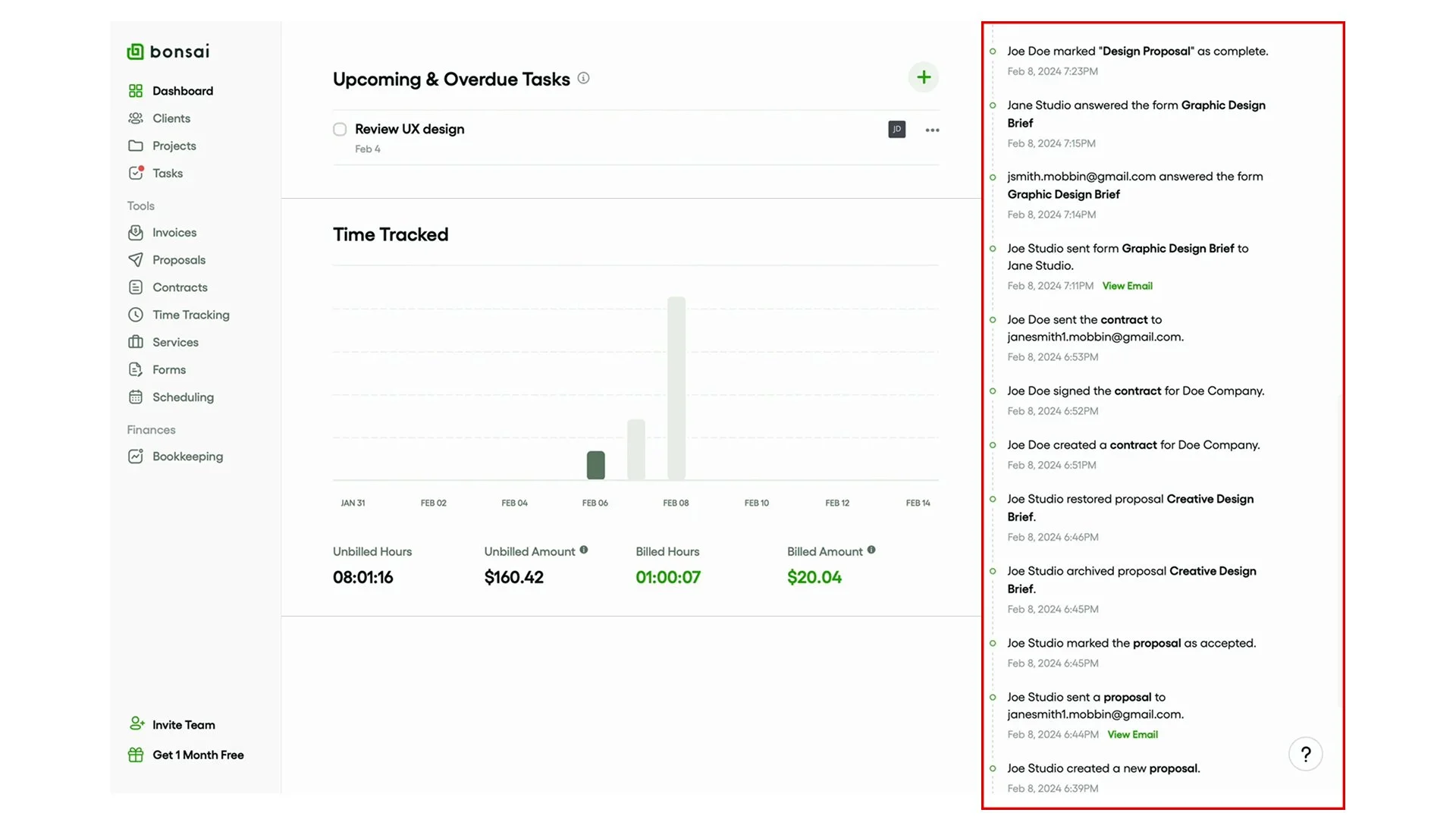
Content Blocks
Outline content with elevated surface.
List Items
Flat within sections, maintaining clear padding and spacing.
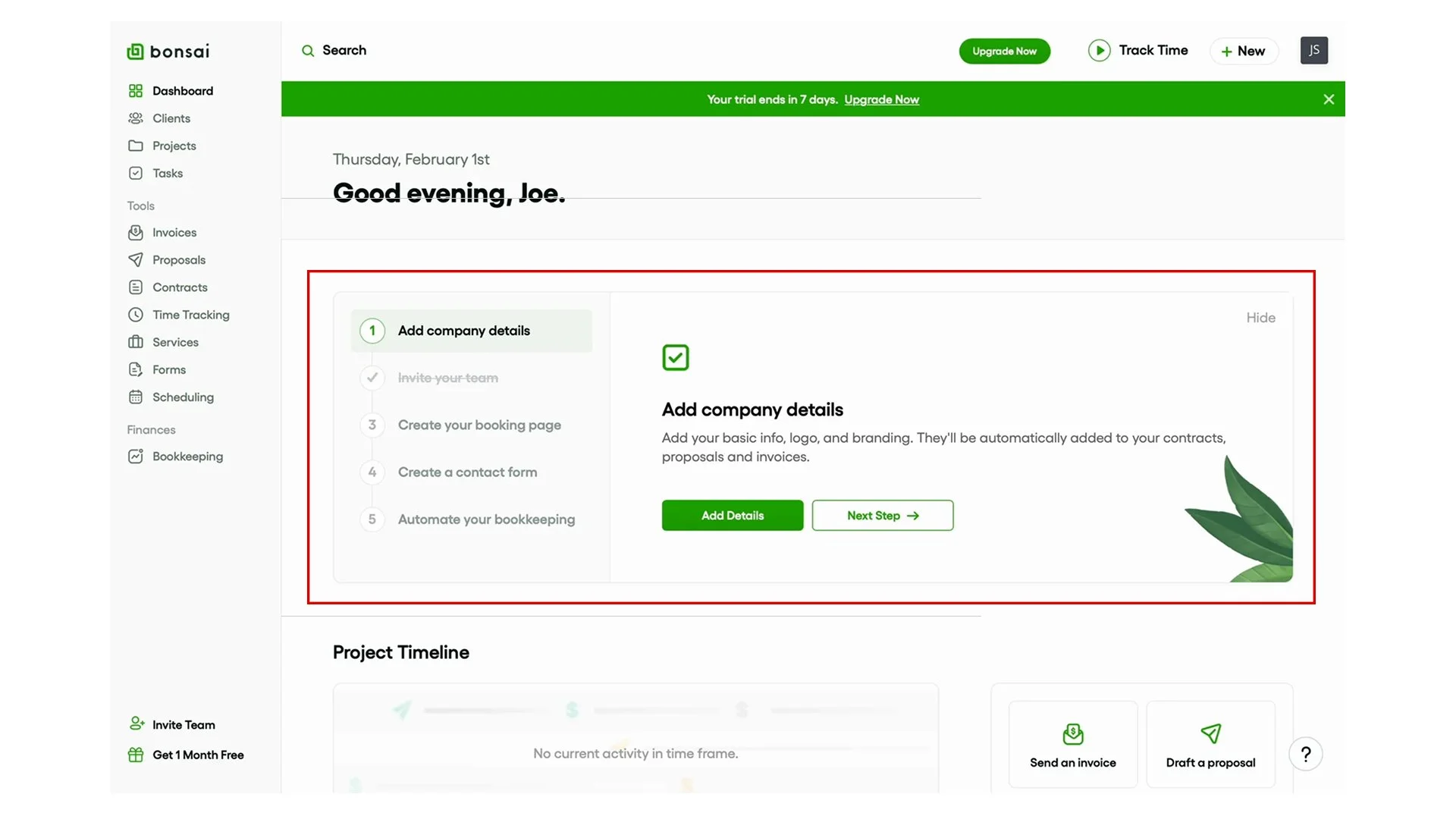
Cards
Outline content
In this example, I used a lot of outlining containers because they aligned with the branding of the product but there are various options including color, shadows, outlines, or a combination.
How This Expands on Material Design
While Material Design’s Color & Elevation guidelines provide foundational principles, a more detailed framework is needed to ensure consistent visual grouping and hierarchy in real-world applications. By documenting container styles, we can:
✔️ Ensure clear, scalable UI patterns across products.
✔️ Improve consistency across teams when placing components on a page.
✔️ Make design handoffs smoother, reducing ambiguity in implementation.


