
Creating a Page-Level Library For Your Product Kit/Design System
In my more recent experiences leading a team, I ran into a few problems that lead to the need for page-level components. The first problem was that newer designers were less familiar with our products were unsure where to find the most up-to-date design. Our design team was ahead of development, meaning there may have been updates to pages that needed to continue carrying forward as we continue progressing forward in the product roadmap. Just because it hadn’t been built yet doesn’t mean we shouldn’t account for it to be there when it is built when designing the next feature. Another problem was that there was no viewable holistic experience. Screens were scattered through multiple Figma files with no record of different states or variations. To accomplish both of these tasks, I created a page library for each of the products connected through core component libraries.
First I’ll break down the component library (consisting of ions, atoms, and molecules), then discuss how I combined those components to make the page library (organisms, templates, and pages).
Component Library
The component library housed individual smaller elements that would be combined to make bigger sections. Global utilities such as colors, font families, imagery, illustrations, and iconography were first. These are elements that are never used by themselves but contributed to the bigger pieces. In atomic design, these have been referred to as ions, which are used in atoms and molecules.
Ions Examples

The rest of the library was composed of atoms and molecules. Atoms are elements used in multiple molecules. For example, a select input, text container, and text area molecule each contain the atom label. Molecules are a combination of atoms to create different types of components.
Atoms
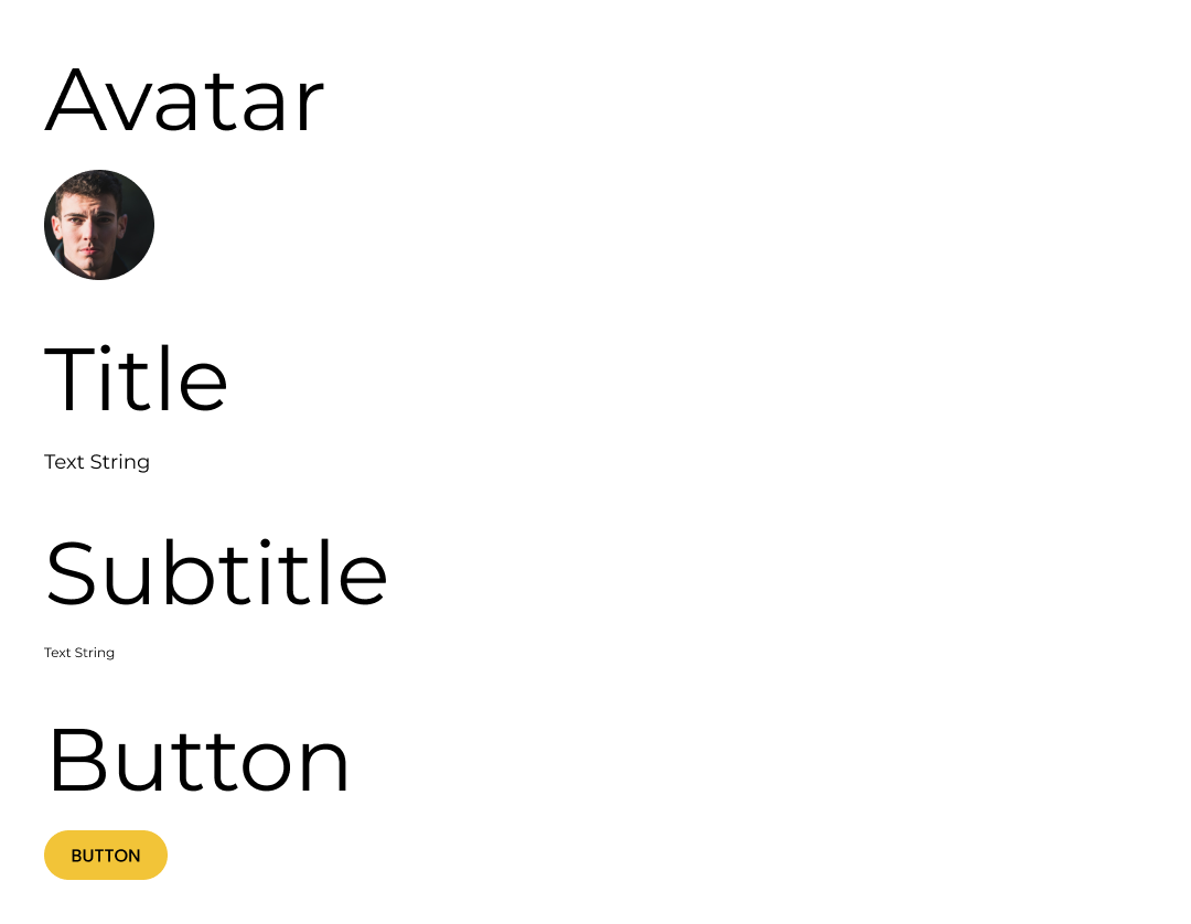
Molecules

Page Library
Now that we have the building blocks put together, it’s time to start assembling some structures. The page library holds organisms, templates, and pages. Organisms get a little tricky because they may be a group of atoms + molecules or a group of organisms. This is where the atomic design language and real-life start differentiating. Depending on what software or coding language you’re using all of these things are built as components, which can house other components in them. That being said, I started calling any group of components that forms a section of a page a “section.” Let’s take a look at Instagram’s profile page. There seem to be 2 main sections: Profile Details and User Posts. Inside each of those sections, there are smaller sections. Here is a more detailed breakdown:
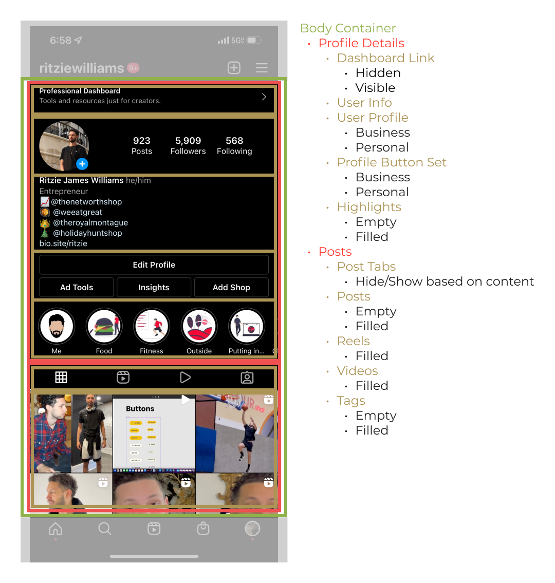
Now both of those sections make up the page content. How this page content works with navigational elements starts moving into defining the template the page is in. In the Instagram example, we see it’s using a top-level template in comparison to a child template which may not have a different layout.

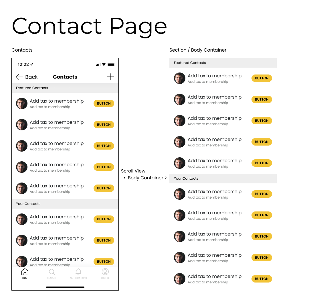
Now knowing the page content and the page layout (template), we combine all the elements to make a page. If you’re building this page individually you can lay it all out in a frame and mark the header and footer as fixed then use it in your file. This is fine and dandy until you turn it into a component. Fixed elements don’t work very as components. This is where the “scroll view“ frame comes into place. We already have a component for the app header, body content, and tab bar. We simply create a frame with vertical scroll enabled that fills the space between the tab bar and the app header to allow our page content to scroll.
Now we can save this whole page as a reusable component and when you need to show a flow or use an existing design as a starting point you can pull in the entire page. Here is an example of a Figma file prototyping a flow using page-level components:
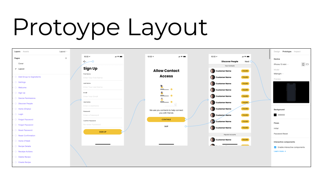
Notice all the screens are purple, meaning they are components being pulled from the page-level design system. For responsive designs, you can even create different variations of screens for different breakpoints. I’ll go into this in more detail in another article but for now, I wanted to show how to advance from the component library to the page library.
Here is an example Figma file: